When I was asked to design a poster for the Six Organs of Admittance show at the Brudenell I instantly wanted to create a screen-print for the event. For the design I had a definite idea that I wanted to create a scene that illustrated the moods within Six Organs' sound palette.
 When considering the screen-printed version of the poster, I decided to alter the design slightly by elongating the height of the poster, giving it a more dynamic impact. With regards to the 'empty space' at the top, with this I wanted to reflect the emptiness of Ben Chasny's music, where much of it is stripped back to guitar and voice.
I also decided to change the colour from a pastel-cream to a mint-blue / green. This was mainly because I have a lot of posters with cream / yellow in the palette and fancied a change. So here's a print process of me making the posters, starting with the first screen with the image burned into it and ready for print
 Getting the first colour down.
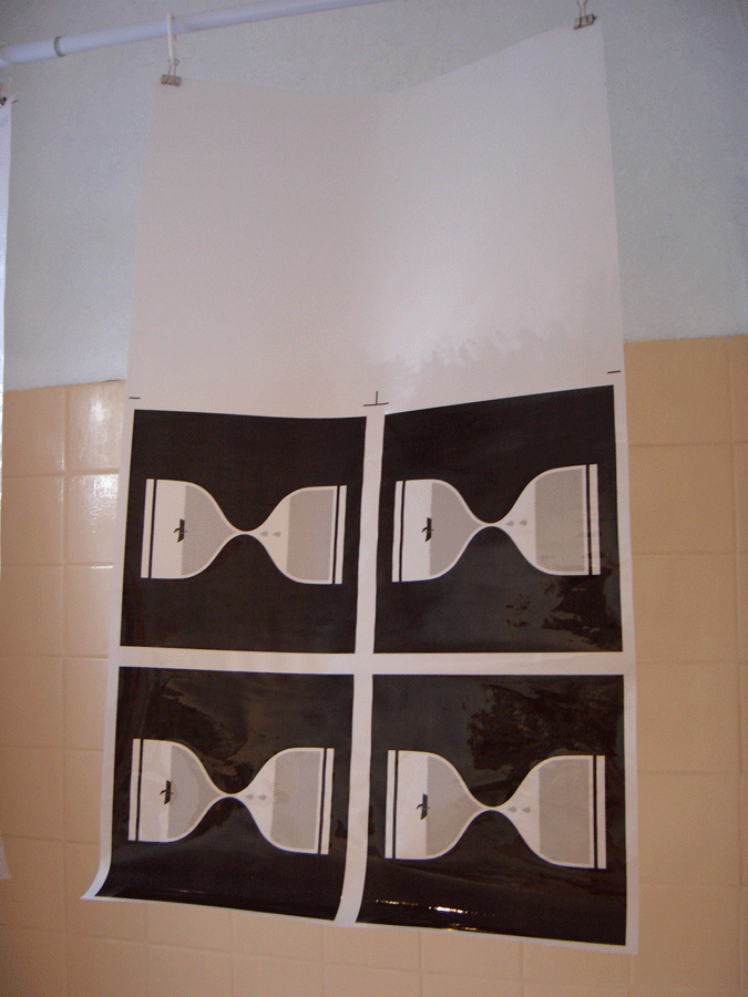
 The first colour on the posters, drying on the racks.
 Printing the second colour, a soft pink.
 The posters on the drying racks with the second colour completed.
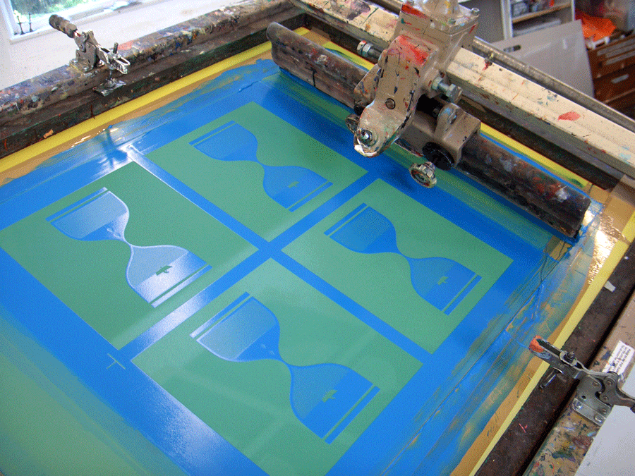
 The third image on the screen, depicting the temple and landscape to white the river runs, ready to be printed.
 The third colour being printed on the posters. You can just about see the image through the ink.
 The poster; cropped, signed & numbered, stamped and ready to be sold at the Brudenell.
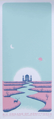 A couple of close ups of the poster.

 The posters sold really well at the gig and are now available in my Big Cartel poster shop. I've also put in the art print version of the design, which is the exact same height and width; just without any of the text.
 So quick thanks to Nath at the Brudenell for letting me have the opportunity to print the posters, Kate at West Yorkshire Print Workshop for tips and hints during the printing process, Alex Steward for being a total dude; playing his first solo gig and it going really well and finally to Ben Chasny; for being a total stand-up dude and playing an incredible set.

 It all kicks off at 7:30, Friday night and will have some special guest bands in the shape of Algiers and Ankles. I will also be there in person giving mini-seminars about screen-printing and the life & times of a poster artist. Plus i'll have stuff for sale, so bring your monies!
Here's a Facebook event for it.
It all kicks off at 7:30, Friday night and will have some special guest bands in the shape of Algiers and Ankles. I will also be there in person giving mini-seminars about screen-printing and the life & times of a poster artist. Plus i'll have stuff for sale, so bring your monies!
Here's a Facebook event for it.