Showing posts with label Process. Show all posts

Tuesday, 4 March 2014

Screen Print Workshop at WYPW

Graham 'Army of Cats' Pilling and myself have been screen-printing since 2005 and 2006 respectively. In fact, we first bonded over our love for the medium and Graham was the printing Overlord who showed me the righteous path and I have never once looked back.

Since 2011, we have kindly been asked back on a twice yearly basis by the West Yorkshire Print Workshop to run a screen-printing workshop based around the printed poster.


Every session has been highly sought after and sold out way in advance - must have something to do with the charming hosts... And every workshop has been a great deal of fun for myself and Graham, as well as all the students who graduate (with honours) into the wide world of screen-printing.


Here is a quick overview from this years event, which took place on the schizophrenic weather weekend of the 8th and 9th of February.


Graham doing a spot of quality control.
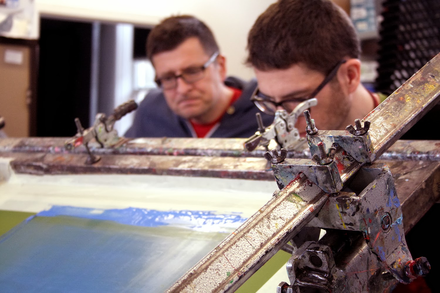

The first day of the workshop gives learners the skills and know-how of how to print. And so every student is given the opportunity to screen-print their own certificate (shown below) as designed by Graham.


The second day is dedicated to the printing of each student's designs and everybody gets the opportunity to print their own 2-colour design to take home. Don't worry, we're here to help throughout this process...

There will no doubt be another workshop this year, although it hasn't been announced yet. If you think this is something you'd fancy - and let's face it, of course it is - then feel free to drop West Yorkshire Print Worskhop a line at 01924 497646 or email @wypw.org and they'll be happy to help you out.

Monday, 23 April 2012

Scottish Winds

I was recently asked by Frightened Rabbit to design a tour poster for their Highlands Tour, in which they played intimate venues in small Scottish towns.

I love the thought of a band on a major label making such an effort to play to their fans who might not be able to get to their shows, which often take place in the major cities of Scotland.

People who know me will know that I'm quite fond of FR; I consider their second album 'The Midnight Organ Fight' to be a genuine modern classic. So when it came to inspiration, I had a lot of ideas at the ready.

Firstly I wanted to have references to their lyrics and themes tackled across their albums; the sea, isolation, faith and lack thereof and combine it with the idea of the band heading up into the unknown wilderness to play these shows.

Here is a quick printing process of the day I spent screen-printing them.

Firstly, the screens are coated with a chemical called Azocol.

Here are the transparencies, which will make up the two layers / colours of the poster.

They are transferred to the screens, using UV light.

The screen is then clamped into the bed place and the first colour has been pulled through with a squeegee.

Hanging out on the drying racks.

The second screen in place, with the imminent brown to complete the print.

Here is the final cropped version of the poster, which I think came out pretty well.

I printed 130 in total, 100 for the band and 30 for me. They're now available in my online shop and if you want one, then get to it, as I understand they were pretty popular on the tour. Also, for one week only I'm offering free p&p within the UK.

Big thanks to the band and their management for letting me do these and also to Alice Munks, who helped get the ball rolling with the band about 18 months ago...

Thursday, 12 April 2012

The Woods

Upon returning from Flatstock 33, Austin a few weeks ago, I had an email from a band called Daughter, requesting a screen-printed poster for their sold out show at the Islington Assembly Hall in London. After studying their output, I decided to base the poster on the song 'The Woods', which sets the scene of St. Christopher, searching for someone's sister in the woods. It was also important to create an environment which evoked the sparse textures used in Daughter's music. Oh, and they requested an exploding sun too!

So, after the design was approved I quickly had to book a session at WYPW to get the posters printed in time for the show and here's how the day went.

Here are the separations on acetate for the printing process.

Here is the first screen with the image burnt on (using a variety of chemicals and UV light) and you can see the cream paint on the screen, which is being pulled through the mesh of the screen to print onto the paper underneath.

Here are the sheets of paper with the first colour printed, drying on the rack.

The second screen, with the image burned onto it and ready to be locked into the screen bed.

The second colour (which was described to me as the start of a 'coral revival') being printed.

How did they turn out? Let's see...

The posters drying on the rack. Next they will be cropped on a heavy-duty paper cutter.

And here is the final poster, cropped and signed & numbered in an edition of 100.

A close-up of St. Christopher.

These posters are now available from my online store.

Thanks for reading. I hope this has given you an insight into how the posters were printed.

Monday, 1 November 2010

Tighten Up

Apologies for it being nigh on a month and no updates, moving house is a long and arduous process as many of you may know...

On to some work then. Recently I was asked to be part of The Black Keys tour poster series for their jaunt across the British Isles in which they played some rather large venues.

Obviously I accepted and here is a process (I know you love them as much as I do) of me screen-printing the batch that would be sent of to their show at the O2 Academy in Newcastle.

The first screen.

The first layer printed and waiting for the second colour.

The second screen ready and raring to go.

Whilst printing some test runs I came across a sheet of purple paper and thought that the design may look cool on it. And it did...

The second colour now printed and drying on the racks.

The final poster all cropped, signed, numbered and stamped.

The poster with human hands to give you an idea of scale. A2 is big!

Close up.

Another close up.

Massive thanks to Kate Desforges at the print workshop for helping me out with the near-catastrophic acetate scenario.

They are also now available from my Big Cartel store, so head over and pick one up today, yeah!

Many more things to be revealed soon, just need to get this house is some sort of order...

Ta ta.

Wednesday, 8 September 2010

Still Windmills

Hi folks.

Let's start things off with some good news, I have just been made a guest blogger over at the Poster Roast site. It's going to be the start of a beautiful relationship with some exciting news and events to happen towards the end of the year but I'm to keep hush on those for the moment.

So if you pop over there now you can see a screen-print process for this Wolf Parade poster that I printed last week.

I'm pretty excited for this show, having already met Mr. Krug of Sunset Rubdown at their gig at the same venue last year. Oh and the fact that Wolf Parade are really good!

They'll be available on Friday 10th September from my Big Cartel shop.

A couple more posters to reveal and as you can see, I've done a lot of posters this Summer. Next up is Sky Larkin.

These Leeds based scamps are so much fun and this poster is based on a song called 'Still Windmills' from their latest album. The colours and style of the poster lend themselves to Jack Hudson's awesome design for their new album 'Kaleide'.

I was also recently asked to do a poster for The Acorn and Born Ruffians double headline show at The Brudenell (again).

This poster is based on a couple of jams by both bands; 'Hummingbird' by Born Ruffians and 'Flood' by The Acorn. I found it interesting to combine different themes and make a poster for two bands who have a very different sound and aesthetic.

Cheers for hanging out!

Thursday, 22 July 2010

Vice Magazine Has a Lot to Answer For

Hiya

Let's set the scene a little bit here. Back in December 2009 I finally got to meet Tobias Hayes, he of Shoes and Socks Off, Shield Your Eyes, Meet Me in St. Louis, I could go on (fame). We recorded a little session in the upstairs of The Cockpit for the currently-resting Tapes podcast project.

Anyways, we became good chums and he said that at some stage in the next year he'd like a twoducksdisco and Shoes and Socks Off collaboration of sorts and a couple of months ago, such an opportunity arose.

Above is the image that Toby sent me that he wanted incorporating into the poster. It's by his lady friend, whose frankly awesome work you can see at her website.

So after working through a few ideas we arrived at our final design, which meant off to the print studios again. Below is the design printed on the acetates, ready for burning to the screens.

Printing the orange layer.

Rows of posters.

Oops, I did it again. I forgot to take pictures of the printing of colour number. All shall be clear across the third colour in the process but to keep you enticed, here is a picture of a screen with emulsion, drying in a cupboard. Wow!

The third and final colour was to be yellow and here is a shot of me mixing it with acrylic medium, which helps it go that little bit further. Basically it doesn't dry out as quick.

I applied in a slightly different approach to screen-printing, the wonderful technique of stippling.

Stippling is fun!

I had to cut a few flame stencils of as the paint would bleed through and underneath the paper after a while and this made splotches and other not so nice things.

The final poster; printed, stippled, cropped, signed, numbered and ready for action.

They will be available on the Shoes and Socks Off tour, which starts this weekend. So get out to a show, see the SASO band, love it and then maybe pick up a poster. Go on, he'd like that and so would I.

Cherry bye.