
My previous design for the band focussed on scale and the over-powering force of nature, which I wanted to explore with this design. So after watching the video, I was inspired at furthering the story told within.
The focal point of the the video being the 'abusive man' seemed like a good figure to use and I wanted to convey his shame and banishment from the shores for his actions. To illustrate his sense of failure as a human I encapsulated him within an 'sea-clock', which is a nautical-based version of the more traditional sand-clock. This links with themes studied through I Like Trains's latest LP 'He Who Saw the Deep'.
 So now you've read about it, here are pictures the print session for the special edition 10" inserts:
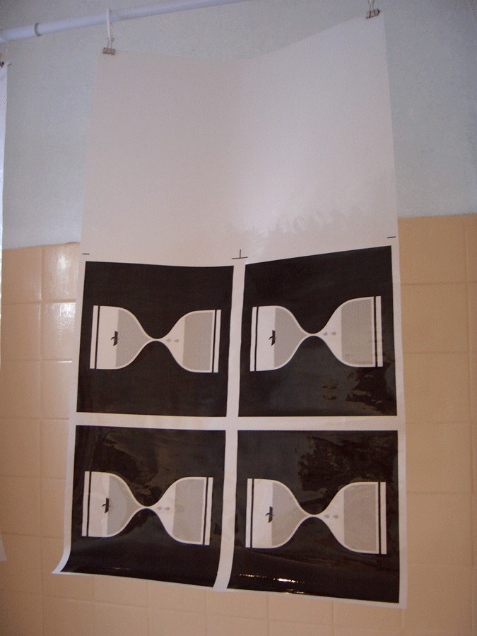 After the tracing paper had become suitably transparent I headed to WYPW to prepare the screens.
 The next stage involves me coating the screen in Azocol and then burning the image (using high voltage UV light) to the screen.
 A close up of the image.
 Then it was time to mix the colour for the prints. Since i'd had to alter the design from being a multi-coloured / multi-layered design to a one-colour print, I had to create a colour that would be striking enough to work on it's own.
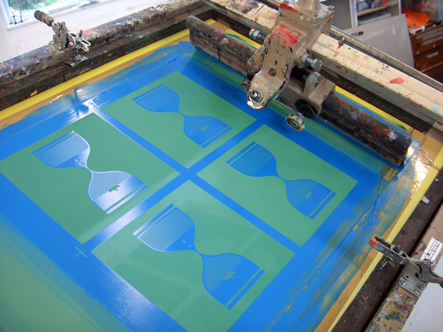
 This is the paint on the screen after the first print. Hope they turned out OK...
 Here they are lined up, ready to be cropped.
 And here is the final cropped version, ready to be signed, numbered and stamped.
 Close up.
 Hopefully that's given you an insight into how I go about designing things and screen-printing. Unfortunately if you want to own one of these limited edition screen-prints they have all sold out but there are standard editions left over in the I Like Trains shop.


