Tuesday, 19 April 2011

Way Down Hadestown

Hello there.

In less than two weeks time I will be London bound for this year's first Poster Roast, taking place on Saturday 30th April and Sunday 1st May. It's co-exisiting alongside Camden Crawl and looks set to be another fun weekend of posters, music and cider (it's sponsored by Gaymers).

Like last year all the exhibiting artists have contributed a bit of artwork which is to be included on a collaborative poster. This will be printed live before the eyes of the Camden Arms (where the whole Poster Roast is going down). The brief this year was to illustrate your favourite dish of a roast dinner. I selected cauliflower cheese because I love the melted chesse seeping into the florets of the cauli... Sorry got carried away a bit there!

To keep the poster-orientated theme of this blog, here is a recent poster that I completed for Leeds folk promotion team Hide & Seek.

Being familiar with Anaïs Mitchell's album 'Hadestown', I wanted to illustrate the story that is told across the record. It's based on the ancient Greek myth of Orpheus embarking upon a quest to the underworld to rescue his wife Eurydice.

Naturally I wanted to create something a bit darker to reflect the story but also create a striking and intriguing image.

Now this is a tenuous link but in keeping with the roast theme, here is a logo that I recently completed for a friend's new film production company, Boo Said The Goose.

Roast goose?! Like I said, tenuous... Anyway, the chaps wanted a bold and colourful logo made up of simple shapes to give it a classic logo feel.

See you spoon.

Monday, 21 March 2011

What's In It For?

Hi.

Here are a couple of recent posters i've completed for the Brudenell Social Club and Late in the Evening promotions. The former being for jangly-poppers Avi Buffalo.

This poster is based on their video for the single 'What's In It For?', where alien flowers blossom and the band run around on a summer's day without a care in the world. Lovely...

The second poster is for synth-noise band Teeth.

Being a bit more on the darker tip of the electronic music spectrum I decided to create a more sinister design. They are also obsessed with aliens so I created a sort of alien invasion vintage sci-fi poster but attempted a more subtler aesthetic to benefit the support act, worriedaboutsatan.

Adios.

Tuesday, 1 March 2011

A Mountain Lullaby

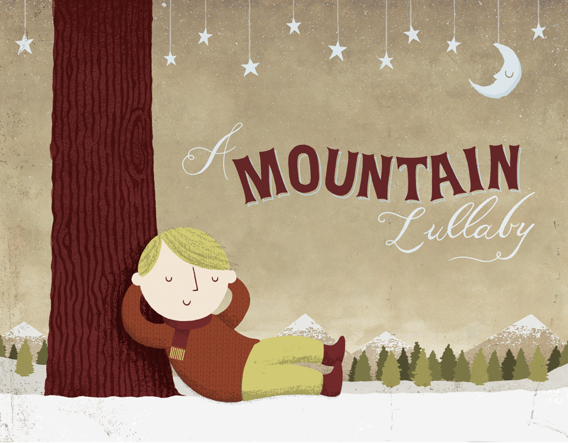
I've been working with the charity We Heart Arts for years now and I'm really excited about their latest project, a fully illustrated (by yours truly) children's book.

That's the cover above and to help promote the book they've put together a number of special pledge options where you can get your name printed in the book as well as a plethora of WHA merchandise. The latter includes a couple of new t-shirt designs i've done exclusively for the pre-order / pledge, which you can do by visiting the Mountain Lullaby website.

So the above t-shirts (titled Nerdasaurus and Up in the Air respectively) are both available in the £35 pledge package and Up in the Air as part of the £25 offer.

Apparently the pre-order is already receiving some high-profile mentions and tweets from the likes of Patrick Wolf and Charlie Higson (this chap from the Fast Show). Awesome!

Wednesday, 23 February 2011

Of All The Times

A few new bits of work to show and tell.

First up, a poster for Ellen & the Escapades. It was nice to work for these lovely sounding folky dudes again, especially for a Record Store Day poster.

This will be available in strictly limited quantities at their RSD performance at Jumbo Records in Leeds, so if you want one I suggest you get out and support some local music in an awesome local record shop!

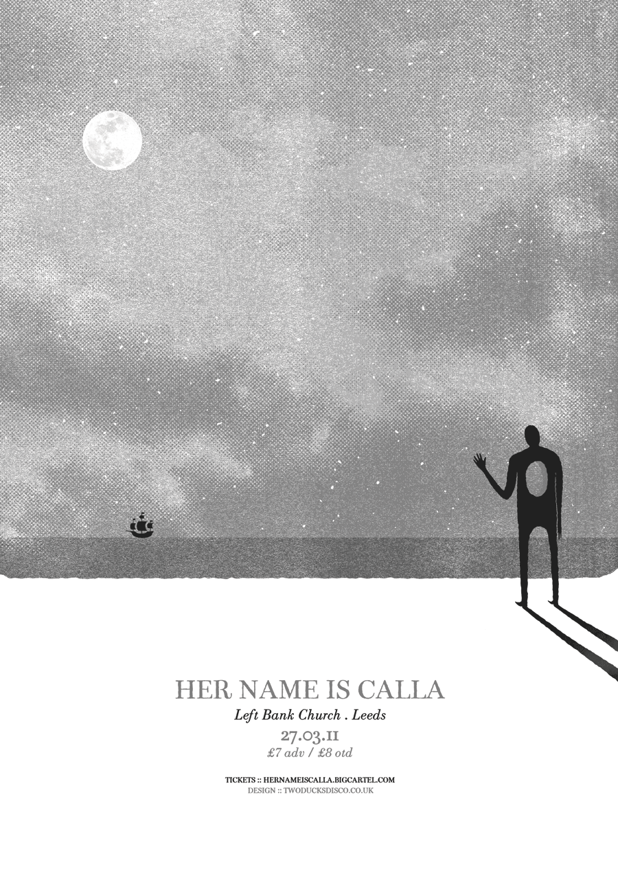
Next up a poster for some old chums of mine Her Name Is Calla and their show at one of Leeds' best kept secrets, Left Back Church.

I can totally imagine the band being suited to such a space; their soft whispered tones creeping through the stone arches before giving way to monoliths of noise rising up through the rafters. Lovely stuff...

Hopefully there'll be more new work to show and tell at the end of the week. It's obviously great getting to work on so many awesome projects but frustrating having to hold off on unveiling them to the public.

Maybe one of my new years resolutions should have been to be more patient...

Friday, 4 February 2011

The Impossible Song & Other Songs

Quick update today because it's Friday and things are very busy at twoducksdisco HQ. I thought I would post the new design i've done for Roddy Woomble's solo show at The Brudenell Social Club in April.

Since I designed the poster for Roddy's previous visit to the Brude, I wanted to continue things in a similar vein by creating a stark and minimal poster that echoed his music and Scottish heritage.

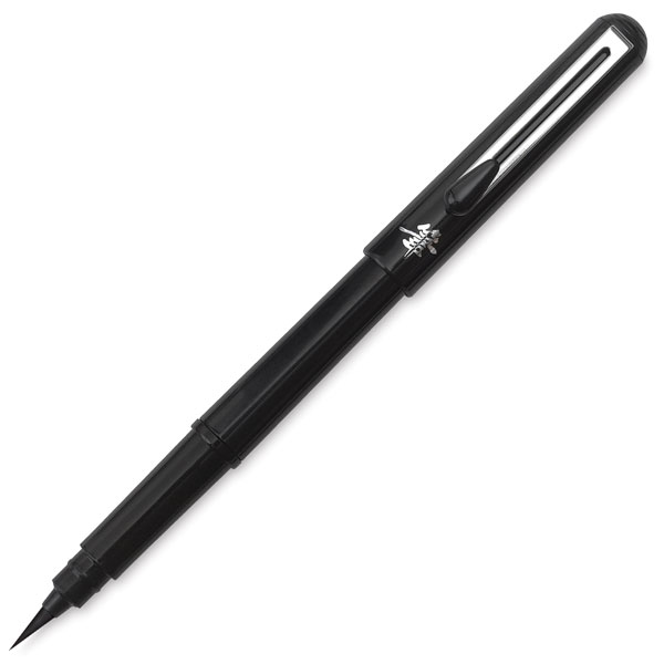
Really happy with how the design came out with the palette being so muted and the text being pretty loose. I think i'm just about getting to grips with the Pentel Pocket Brush now and it's especially good for script-like type.

Hope you all have good weekends!

Wednesday, 2 February 2011

Calling Occupants Of Interplanetary Craft

Last Summer I was interviewed by an incredibly pleasant chap called Joe, who was studying Graphics at Liverpool John Moore's University. He was putting together a dissertation which would focus on how promotion effects design and the community around it and vice versa.

This was something I was more than happy to help out with as it's something that I find very interesting as I am a part of the scene where promoters and artists rub shoulders and help each other out.

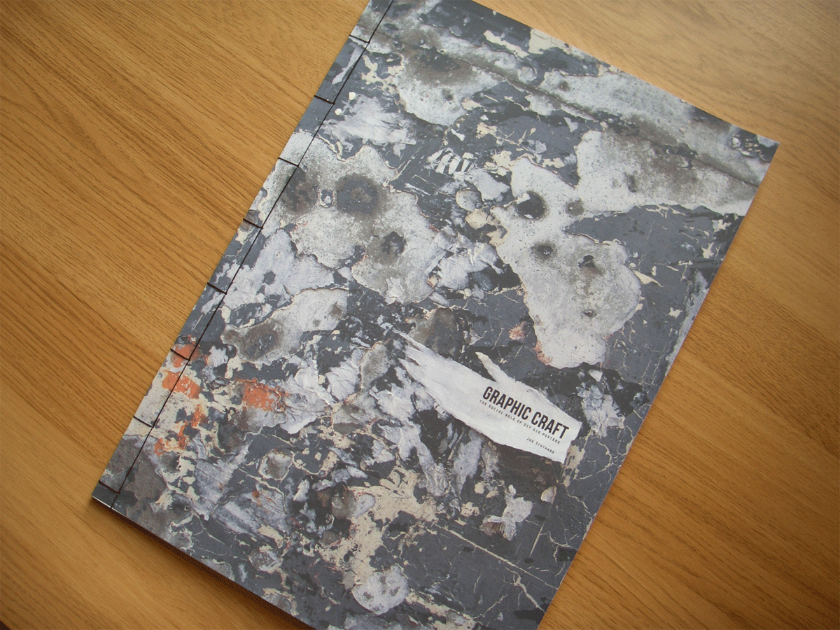
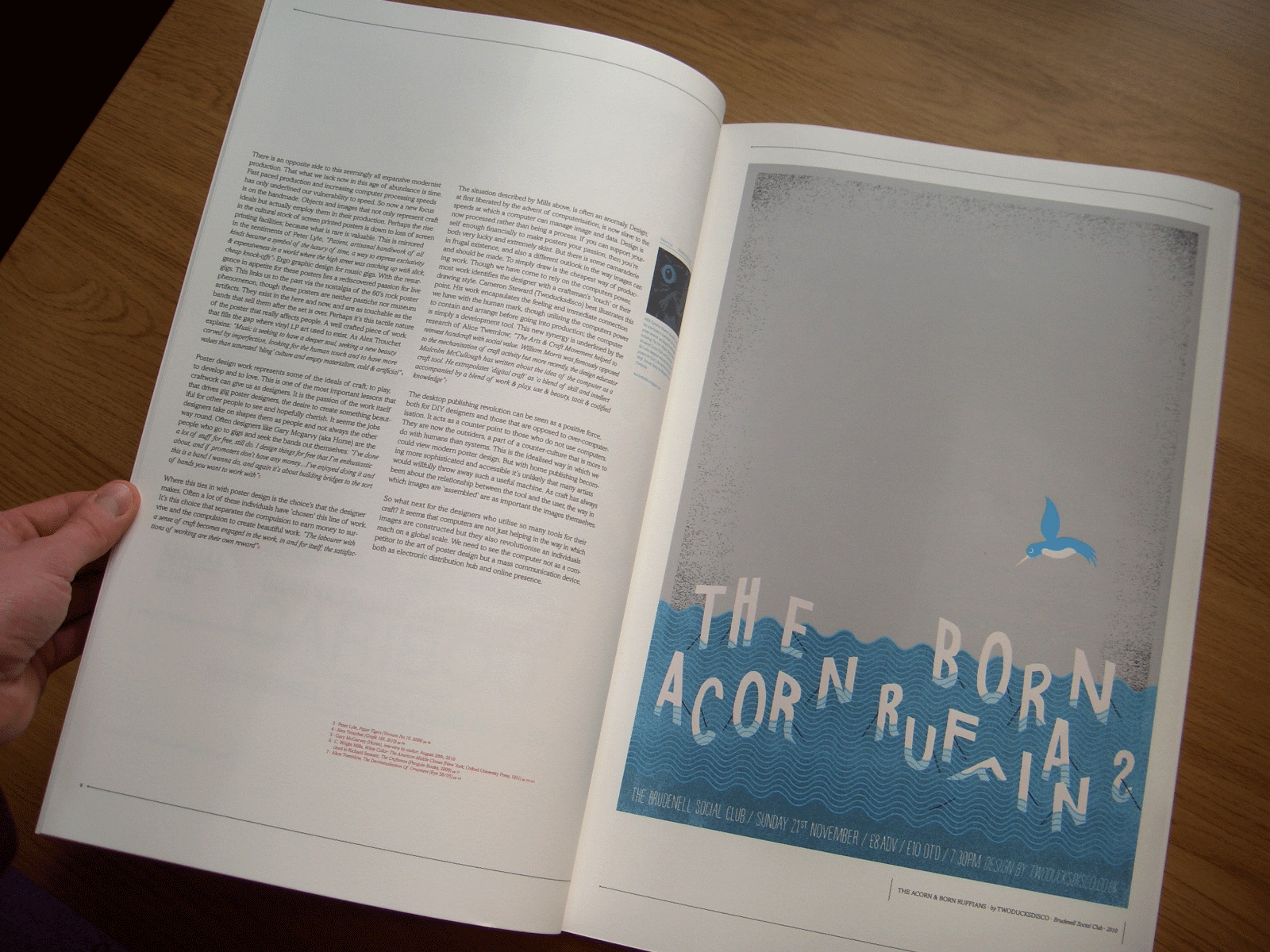
After compiling all his research he presented his work in a wonderfully bound book, of which he was kind enough to send me a copy. And here are the pictures of the pages I feature on... lovely stuff.

A double page spread of my God is an Astronaut and Sky Larkin posters.

The front cover of the book.

My Born Ruffians and The Acorn poster.

Close up.

A little background info...

The whole book was beautifully presented printed on heavy recycled paper and with stylish little border doodads.

Thanks very much to Joe for sending me a copy plus asking me to help out in the first place. As an artist it's always nice to see your work printed on nice stock and presented with as much care as it was created. Plus it's a very insightful read, so a complete package really...

Monday, 31 January 2011

Chocks Away

Hi all

So if any of you happen to follow my twittering's (or tweets as they're better known) then you may have seen this painting process evole over the past week or so.

Quick back story: It's was my sister's birthday on Friday (HB sis) and I decided to paint her a picture of a few of her favourite things; baking, skydiving and moustaches.

The first stage: painting the sky gradient.

Next I taped out the shapes of the parachute and the cupcake. I just used masking tape to get fine edges and painted white onto the canvas. I then added some pink detail to the parachute and frosting to the cake.

Here is a detail shot of the cupcake after i'd painted the rest of the colour.

As with most things that I do, I like to inject some extra cute and so I decided to paint a little face on my cupcake...

And then for the finishing touches; I cut some shapes out of felt and glued them to the canvas. Here is a detail shot of the felt moustache on the cupcake and a felt cloud wandering out of focus.

So, here be the finished painting titled 'Chocks Away'. And if you were wondering, my sister loves it!

Hope you enjoyed that little process. A little bit different from my normal screen-printing ones...

Monday, 24 January 2011

House of Low Culture

Hi folks

Apologies for being a bit quiet on the western front. I have been insanely busy these past few weeks and have lots of projects to show you very soon. In some good news, I Like Trains sold out of the posters I screen-printed for them one week into their three week tour. Nice one lads!

On to something I can show you. Since Poster Roast Leeds I made friends with a lovely Leeds-based collective of media types called Low Culture. Recently they asked me to design a poster for them, promoting their services and aiming to recruit some newbies into the fold.

Hopefully next time you tune in there'll be more exciting news. Some things that I can't wait to show you include; Cover design for a Children's book, new t-shirt for We Heart Arts, Identity for new Brighton-based record label, the list goes on...

Stay safe!

Wednesday, 12 January 2011

A Father's Son

Hi forks

So last week I got to do some screen-printing for the mighty Leeds post-rock giants that are I Like Trains. This was also my first session at Manchester's Hot Bed Press. Added to the fact that the band went on tour at the weekend and needed the posters delivered by then, the pressure was on...

So to the speedy nature at which the poster was printed, I failed to get any pictures of the acetates, which were burned to the screen, so here is a picture of my mixing the blue, which would be the first colour I printed.

Here is the screen for the first colour, awaiting it's fate... blue!

The first colour printed and drying on the racks.

Here's to fallen comrades.

The second colour printed, which is the lighthouse, ship and tour dates.

The final poster, cropped, signed and numbered and ready to be shipped (no pun intended) to the band.

A detail shot of the lighthouse, searching for the lost ship.

So apologies for not having the most detailed of print processes but the session was more stressful than anticipated. But I am happy with the outcome and I hope you've enjoyed a little insight to the world of screen-printing.

Ta ta.

Monday, 3 January 2011

Camelback Cinema

Happy new year y'all. Hope your festive holidays were warm and joyeux!

Due to the popularity of my '100 abandoned houses' post that I blogged about last year, I thought it would be worth contributing this little follow up. It's an article I stumbled across on the Guardian website and features stunning photography of a post-industrial Detroit city.

[Photograph of Michigan Central Station by Yves Marchand and Romain Meffre]

It also reminds me of an incredible documentary (one of the best i've ever seen) 'Requiem for Detroit', which is all about the rise and fall of the motor city. Really fascinating and quite dark.

Anyway, on to some work. Here is a flyer / poster design I recently completed for a Leeds-based collective who show independent films at one of Britain's smallest cinemas.

I've yet to attend but will hopefully get along at some point this year. I mean tea, cake, intimate setting and independent cinema are a few of my favourite things. Here's a facebook link for more information.

More things to come soon including a screen-printed poster process (yes, another one) for I Like Trains and much, much more.