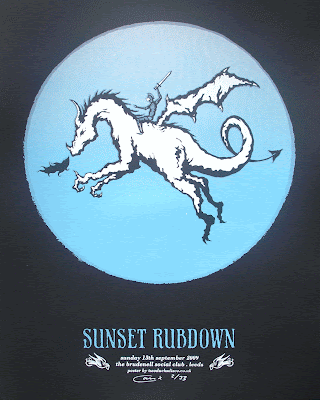
With this in mind I made a sketch based on the cowboy / horse illustration from the Magnolia poster. I wanted the image to relate to SR's recent album 'Dragonslayer' and so I drew some dude riding a dragon... genius!
 I then inked in the illustration using my tried and tested Pentel Pocket Brush.
 And then I went about doing all the fancy Photoshop things like adding colour and then making the separations ready for screen-printing. This time I added a moon as opposed to a sunset, as they've got a track called 'Silver Moons'. This also gave me the idea to actually print silver when it came to the screen-printing process.
 The acetate for the white layer of the print.
 Printing the white layer.
 The white layer down on the navy card, looking all nice.
 The acetate for the 'split (yes, another) fountain' layer.
 Printing the 'split'.
 The finshed poster on navy card.
 Detail on tan card.
 The finished poster on black card.
 So there you go, a little insight to the design and print process, phew!
Also worth a mention is that Tubelord's Rainboliatric project got blogged about on the Rock Sound website, where you can see a few of my efforts littered amongst the hilariously great artwork from other great UK illustrators! Way to go dudes!!

2 comments:
this poster is awesome and i'm very much looking forward to this gig :D xxx
think we're getting there for 10:30 - It's gonna be a printing nightmare tomorrow! x
Post a Comment