Thursday 1 December 2011

Learned to Surf

Last year, Superchunk released what has become one of my favourite ever records, 'Majesty Shredding'. When I learned they were coming to play their first show in the UK in 11 years I knew I had to be there. Sadly, I am now unable to see them due to a rescheduling of Jeff Mangum's ATP festival but I still managed to design a poster for their headline show at The Scala in London.

Since this is a poster I've dreamed of doing for about a year, the actual design concept fell together quite quickly. I basically wanted their mascot 'Tube Guy' riding some waves with a reluctant cat. Simple...

Here is the original sketch and how it progressed to being the final design in Photoshop.

Tube Surf Animation

Without further ado, here is the print process for the Superchunk poster; starting with a picture of the transparencies, which are then 'burned' to the screens using chemicals and UV light.

The first screen in place, ready to be printed.

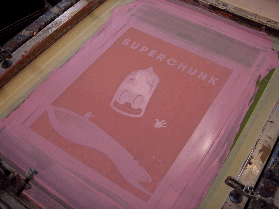
The first colour to be printed was a 'dusty' pink.

The first colour being pulled over the screen, transferring the paint through tiny mesh holes and onto the paper below.

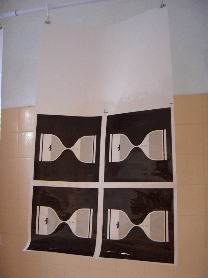
Here are the posters, having had the first colour printed, drying and awaiting the second colour.

Whilst mixing the second colour, I discovered a face on the spatula... Creepy.

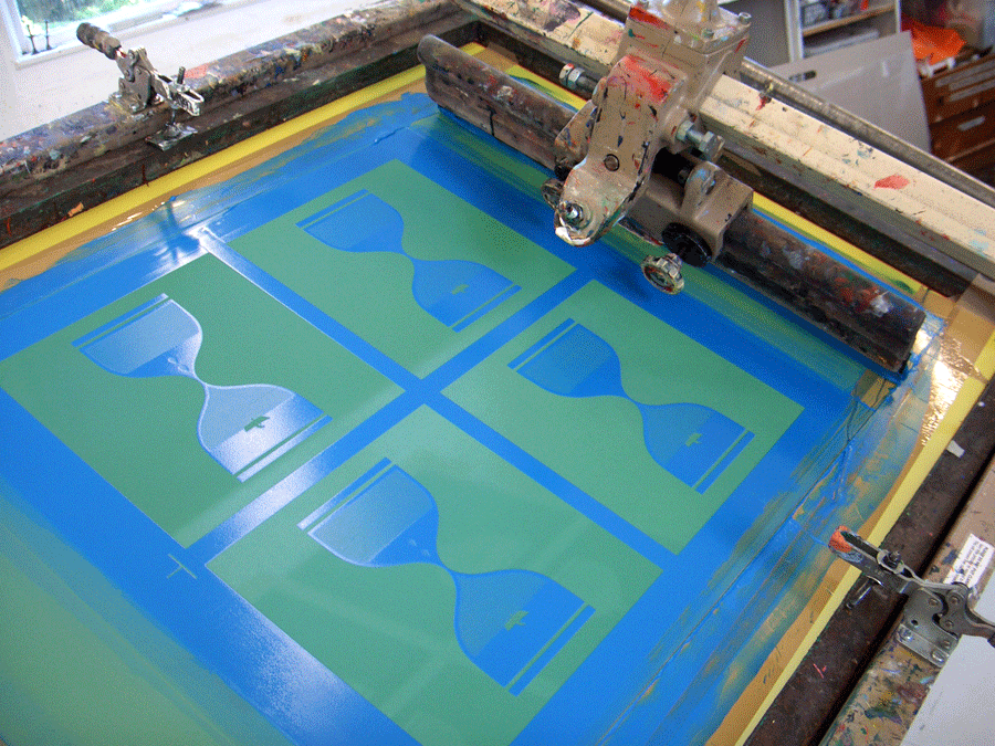
The second colour is down.

The posters on the drying racks, waiting to be signed and numbered.

The posters came out great in the end and I managed to produce a run of 62, 30 of which will on sale from the band at the show tonight.

I do of course have the remaining 32 for sale from my online store. So if you want one, head over and grab one before they're all gone. They go 'live' at 10pm tonight!

Friday 21 October 2011

The Beat that my Heart Skipped

Here is a new poster for Her Name Is Calla; a band I have known for ages and have enjoyed their music for many years. So it was nice to be hired outside of the band (by Aim Low Promotions) to continue working with the post-rock troop.

I tried to continue the theme which I established in my previous poster for HNIC by illustrating an atmospheric yet minimal scene. This design progresses from the Left Bank poster by uniting lovers and creating a romantic setting. Aww...

The line-up is sound and who knows, if you're single you could just find love there.

Thursday 20 October 2011

When the Tide Creeps In

If you're into records and you've ever visited Leeds, then chances are that you've been to Jumbo Records. I have picked up some amazing vinyl from there over the years and am always appreciative of the helpful and friendly staff.

I got an email from Ellen and the Escapades last week, asking for a last minute poster design for their in-store performance as part of Jumbo Records' 40th Birthday celebrations, which also coincides with Ellen's last single release. Of course I jumped at the opportunity and came up with this little poster.

It all starts at midday this Saturday (22nd) and if you're in Leeds, you'd be daft to miss it. My chums in Lanterns on the Lake are also playing, as is Corrine Bailey Rae and the ever-reliable Serious Sam Barrett.

Tuesday 18 October 2011

On and On

Here is a new t-shirt that I designed for Leeds-based folk-rock dudes Fossil Collective.

The specifications for the design were to include a stag and that was about it, so it was a fun project in which to interpret in my own style. I decided to develop the stag's antlers to create a constellation, adding a grand feel to the design - reflecting the grand sounds of the band.

Here is the video for the track 'On and On', which was put together by Broken Pixel, who has recently collaborated with my good friend Graham 'Army of Cats' Pilling on this Opera North promotional short.

Myself and Graham will be running a print workshop in November at WYPW, Mirfield. More details on that to come soon.

Friday 14 October 2011

Gracious Tide, Take Me Home

When asked by Lanterns on the Lake to design a whole new range of merchandise for the forthcoming autumn and winter months I got very excited about creating something for a band I'd admired for a long time. You're Almost There by Lanterns on the Lake

Their debut LP 'Gracious Tide, Take Me Home' was used as the main theme for the designs and we decided to explore the themes of being lost at sea and trying to feel connected with a world in which we are not familiar with. You can see the full range in their Big Cartel store, as well as a poster of the same design. Hopefully we'll be able to reveal more designs as and when they are printed but rest assured, there is more to come.

They're about to go on tour around the UK with Yann Tiersen and then do their own UK jaunt, as well as a trip around Europe, so if you go out to see them, then do be sure to pick up some new threads to keep you warm in these cold months.

Wednesday 6 July 2011

Trouble and Strife

Here are some pictures from the second exhibition I was involved in this weekend past.

You can see more of the pictures here, c/o the venue.

Here is a video from the launch event (Saturday 2nd) with Jamie Portch's and my works at 1:16.

The month-long exhibition is being held in the SNO!Lounge at SNO!Zone, Milton Keynes, so if you're in the area why not pop in, absorb some nice art, then go snowboarding...

Monday 4 July 2011

Pictures at an Exhibition

On Friday 1st July I travelled across the width of northern England, to Middlesbrough. The reason; my debut solo poster exhibition, which also featured collages by Graham Hutchinson.

The exhibition was curated by Henry Carden, so firstly I would like to thank him for making this all happen. And for taking me to the Empire club, wow!

Here are some pictures from the event.

A blast from the past.

Here are a few of Graham's awesome little collages.

And finally a shot of Henry at the desk on Saturday.

On the Friday launch, there was music from Algiers and Ankles, both of whom were awesome, so thanks lads! Also, thanks to all those who came down and chatted, I had a reet good time.

Here is a video of Algiers performing their hit single; 'Four Priests', Directed by Darren 'In the Woods' Topliss.

Wednesday 29 June 2011

Pictures in an Exhibition

This weekend see's exhibition season taking off into full flight with not one but two exhibitions that I will be a part of.

The first being 'The debut solo poster exhibition by twoducksdisco', which will be happening in Middlesbrough at the Pop-Up Gallery.

It all kicks off at 7:30, Friday night and will have some special guest bands in the shape of Algiers and Ankles. I will also be there in person giving mini-seminars about screen-printing and the life & times of a poster artist. Plus i'll have stuff for sale, so bring your monies! Here's a Facebook event for it.

Secondly, I am also contributing a few screen-prints to 'Parkstrife'; an exhibition in the Sno!Lounge at Sno!Zone, Milton Keynes. Yes, you read that correctly, Sno!Zone.

This will be more a permanent exhibition for the lounge, where functions and other such events are held. There's a Facebook event for that too. Plus, a little interview that I did with Jibber Jabber; a snow sports blog at Sno!Zone.

Pictures from both events to follow next week.

Saturday 18 June 2011

Gotta Keep Movin'

Here is a new poster for Leeds based promotion team Hide & Seek, who are spreading their folky wings South-bound to Sheffield.

Apparently they'd be trying to book American folk singer Willy Mason for quite some time, so I wanted to create something special to mark the occasion for them.

Willy's first album feels like an extensive road trip on foot, so I wanted to create a triptych-style story board depicting his journey across Americana.

I know the H&S lads were pleased with it, so hopefully Willy is too...

Monday 13 June 2011

Elk River

When I was asked to design a poster for the Six Organs of Admittance show at the Brudenell I instantly wanted to create a screen-print for the event. For the design I had a definite idea that I wanted to create a scene that illustrated the moods within Six Organs' sound palette.

When considering the screen-printed version of the poster, I decided to alter the design slightly by elongating the height of the poster, giving it a more dynamic impact. With regards to the 'empty space' at the top, with this I wanted to reflect the emptiness of Ben Chasny's music, where much of it is stripped back to guitar and voice.

I also decided to change the colour from a pastel-cream to a mint-blue / green. This was mainly because I have a lot of posters with cream / yellow in the palette and fancied a change. So here's a print process of me making the posters, starting with the first screen with the image burned into it and ready for print

Getting the first colour down.

The first colour on the posters, drying on the racks.

Printing the second colour, a soft pink.

The posters on the drying racks with the second colour completed.

The third image on the screen, depicting the temple and landscape to white the river runs, ready to be printed.

The third colour being printed on the posters. You can just about see the image through the ink.

The poster; cropped, signed & numbered, stamped and ready to be sold at the Brudenell.

A couple of close ups of the poster.

The posters sold really well at the gig and are now available in my Big Cartel poster shop. I've also put in the art print version of the design, which is the exact same height and width; just without any of the text.

So quick thanks to Nath at the Brudenell for letting me have the opportunity to print the posters, Kate at West Yorkshire Print Workshop for tips and hints during the printing process, Alex Steward for being a total dude; playing his first solo gig and it going really well and finally to Ben Chasny; for being a total stand-up dude and playing an incredible set.

Friday 3 June 2011

Sirens

The mighty I Like Trains got back in touch recently, asking me to design their latest single 'Sirens'. I accepted and got thinking how best to illustrate the song.

My previous design for the band focussed on scale and the over-powering force of nature, which I wanted to explore with this design. So after watching the video, I was inspired at furthering the story told within.

The focal point of the the video being the 'abusive man' seemed like a good figure to use and I wanted to convey his shame and banishment from the shores for his actions. To illustrate his sense of failure as a human I encapsulated him within an 'sea-clock', which is a nautical-based version of the more traditional sand-clock. This links with themes studied through I Like Trains's latest LP 'He Who Saw the Deep'.

So now you've read about it, here are pictures the print session for the special edition 10" inserts:

Firstly, here are the tracing paper sheets, having been greased up with vegetable oil (to make them more transparent for the print process) and hanging up in my shower.

After the tracing paper had become suitably transparent I headed to WYPW to prepare the screens.

The next stage involves me coating the screen in Azocol and then burning the image (using high voltage UV light) to the screen.

A close up of the image.

Then it was time to mix the colour for the prints. Since i'd had to alter the design from being a multi-coloured / multi-layered design to a one-colour print, I had to create a colour that would be striking enough to work on it's own.

This is the paint on the screen after the first print. Hope they turned out OK...

Here they are lined up, ready to be cropped.

And here is the final cropped version, ready to be signed, numbered and stamped.

Close up.

Hopefully that's given you an insight into how I go about designing things and screen-printing. Unfortunately if you want to own one of these limited edition screen-prints they have all sold out but there are standard editions left over in the I Like Trains shop.