Thursday 5 May 2016

Dream 3


Now in it's 5th year, the global phenomenon that is Secret 7 returned to showcase 700 unique record sleeves and raise a whole bunch of money for Amnesty International UK.

This year things were arranged a little differently with a month long exhibition taking place at Sonos Studio in Shoreditch to whet the appetites of the vinyl-crazed public ahead of the sale, which took place on Monday 2nd May 2016.

As ever there was a cool mix of bands and artists assembled by Kevin King (thanks for having me back) to choose from, including The Jam, Chvrches, Jack Garratt, Tame Impala, Etta James and John Lennon. The track that immediately stood out to me was the gorgeous 'Dream 3' by Max Richter; an artist I'd long admired and whose album 'The Blue Notebooks' is simply one of the most sublime records I've ever heard.


When it came to designing artwork for the piece of music taken from an 8 hour "sleep aid", I wanted to make sure I captured that dream-like quality and made something which resonated with the aesthetic of the existing album artwork.


I started with the idea of duplicating a moon image, which whilst creating a hypnotic effect much in the tradition of Richter's music, also conjured up ideas of dreams within dreams. It was all getting a bit too Inception-like but I thought the idea was strong enough to run with...


And so I ended up sketching the idea to give it an organic feel, hoping to reflect the nature of Richter's music. Although liking the outcome, to me it didn't evoke the mood or atmosphere of the track. This is something that needed to have depth and the sketch just felt too 1 dimensional.


To develop the idea of repeated patterns I decided to experiment with the concept of sleep as part of the cyclical nature of human existence and that we all have patterns that we replay - our daily routine. Of course we sleep, eat, work and play (if we're lucky) on a daily basis. This is echoed throughout the week, month, year, our entire lifespan and it was interesting to explore the idea that although this sounds repetitive and mundane, in fact it's the small joys we bring to ourselves on a daily basis which gives our lives variety and meaning, and that is something to be celebrated!


In an attempt to capture that idea (and in keeping with the minimalist nature of the music) I set about painting ink onto a rotating piece of paper, which I prepared on my turntable. There were many attempts (as the above image shows - plus many more were discarded) before I found the perfect representation of my concept.


The image was mounted on an inked gradient and then mounted on the blank record sleeve.

So there you have it! A little bit of an insight into the thought process and execution behind my creation and a bit of fanboy gushing for Max - which seriously, if you haven't heard 'The Blue Notebooks', then go do that right now! Oh, and if you brought my contribution to this fantastic cause, then thank you. I hope you like it.

Wednesday 3 February 2016

Go Forth & Print

On the last weekend of January 2016, myself and Graham 'Army of Cats' Pilling returned to deliver our biannual 'Screen-Printed Posters' course at West Yorkshire Print Workshop.

As always it was great to hang out with Graham and of course meet the 6 students, upon whom we would dispel the myths of screen-printing, teach them some new tricks and generally have a bit of fun across the two day course.


The course is designed to give absolutely anybody a basic introduction to the skills and techniques required for screen-printing. Across the first day, the students are taught how to prepare a screen and then print a two-colour poster, which they are able to take home at the end of the weekend - a kind of certificate if you will.


The students are shown how to print using just the squeegee and their upper limbs (arms), as well as having a go at operating the screen-bed arm.


Having completed printing on day one, the students are shown how to separate layers and prepare files suitable for the screen-printing process by Graham using Photoshop. This is always a popular part of the course, as Graham offers his hints and tips and happily discusses the process of preparing for screen-printing.


The next day allows the students to print their own 2-colour poster, which they have prepared, rounding off a superb weekend of skill sharing and teamwork. Marvellous.


So if that's whet your appetite for the more physical process of printing, then Graham and myself will be returning to WYPW across the weekend of 25th and 26th of June 2016 for another instalment of 'Screen-Printed Posters', which you can book here. I hope you can join us!

Monday 12 May 2014

Age of Reason


On 19th April 2014 the needle was dropped into the groove of internationally celebrated Record Store Day for another dose of limited edition vinyl and musical merriment!

Again I was asked by the impassioned overlord of Secret 7 Mr. Kevin King to contribute a one-off record sleeve to be sold on the big day.

The charity this year was War Child and an almighty £41,500 was raised for the cause. This was great news and it brought the total Secret 7 contribution to over £105,000.


I chose to illustrate 'Age of Reason' (track above) for Brummy metal newcomers Black Sabbath and went down a more graphic-vector route, hoping to offer something different for the lads!

I also screen-printed the cover, to give it that va-va voom. Below is the final design and then the process.


Thank you to Kevin King for having me along for the journey again and on the off-chance that Ozzy, Tony or Geezer saw the artwork, I hope you liked it. Oh and if you were the person who bought it, thanks to you too.

Tuesday 4 March 2014

Screen Print Workshop at WYPW

Graham 'Army of Cats' Pilling and myself have been screen-printing since 2005 and 2006 respectively. In fact, we first bonded over our love for the medium and Graham was the printing Overlord who showed me the righteous path and I have never once looked back.

Since 2011, we have kindly been asked back on a twice yearly basis by the West Yorkshire Print Workshop to run a screen-printing workshop based around the printed poster.


Every session has been highly sought after and sold out way in advance - must have something to do with the charming hosts... And every workshop has been a great deal of fun for myself and Graham, as well as all the students who graduate (with honours) into the wide world of screen-printing.


Here is a quick overview from this years event, which took place on the schizophrenic weather weekend of the 8th and 9th of February.


Graham doing a spot of quality control.


The first day of the workshop gives learners the skills and know-how of how to print. And so every student is given the opportunity to screen-print their own certificate (shown below) as designed by Graham.


The second day is dedicated to the printing of each student's designs and everybody gets the opportunity to print their own 2-colour design to take home. Don't worry, we're here to help throughout this process...

There will no doubt be another workshop this year, although it hasn't been announced yet. If you think this is something you'd fancy - and let's face it, of course it is - then feel free to drop West Yorkshire Print Worskhop a line at 01924 497646 or email @wypw.org and they'll be happy to help you out.

Friday 21 June 2013

Harder Than You Think

Remember that post where I designed a sleeve for Laura Marling's 'The Beast'?

Well, that alongside 699 other individually crafted record sleeves raised over £30,000 for the Art Against Knives charity! Here's a little video from the day.

As well as contributing a print for Laura Marling, I also designed a cover for another band involved with the project, Public Enemy. A band of whom I am very fond of, having seen them live in Nottingham when I was 18 years old.

Above is the front cover of the design, which was digitally printed for the exhibition.

Thanks again to Kevin for asking me to be a part of the show. It's always great to know that you can make a little difference to a big cause!

If you want to see all the other covers for the project, then visit the Secret 7 site, which I highly recommend that you do.

Thursday 30 May 2013

I Need My Girl

The National.

What a wonderful American band. Having just released their sixth studio album 'Trouble Will Find Me' I find myself constantly in discussion with friends and family about just how great this band are.

After purchasing the album last week I have listened to it every day. It is beautiful, sombre, restrained, complex, melodic and a whole host of other adjectives fans would adopt to articulate their praise and love for the NY five piece.

Early highlights include 'Fireproof', 'I Should Live in Salt' and 'I Need My Girl', the latter of which I have decided to artistically interpret using magazine cut-outs, acrylic paint and colour-transparent overlays.

'I Need My Girl'
Mixed Media (2013) with frame 33.5 x 28.5cm

Not sure whether to sell the piece yet, if there's any interest then I'll put it up in the twoducksdisco Big Cartel shop. Or email me at twoducksdisco@gmail.com

If you haven't heard the album yet, I suggest you do so. Here's a live version of 'I Need My Girl'. Enjoy.

Monday 22 April 2013

The Beast

I was honoured to be asked to participate in this year's Secret 7 project, curated by Kevin King.

If you don't know, Secret 7 involves 700 artists/designers being given a blank sleeve each. The artist picks a song from a list of 7 bands/musicians, which they can illustrate in any way they see fit. Each 7" sleeve (including vinyl) is sold for £40, every penny of which goes to Art Against Knives.

I picked to illustrate 'The Beast' by Laura Marling using the print-making technique, linocut; a process which I felt suited Laura's traditional-folk style.

The opening exhibition took place in London at Mother, 10 Redchurch Street, London, E2 7DD on Thursday 11th April, ahead of Record Store Day (Saturday 13th April).

Here's hoping that last year's £33,500 was topped!

Friday 3 August 2012

No Direction Home

Due to the success of the End of the Road festival (an annual music event which leans more towards the contemporary folk end of the spectrum) the organisers saw fit to create a new summer attraction in the shape of No Direction Home.

Musically, the festival takes cues from the folk and Americana revivalist scene, this small festival (set in the grounds of Welbeck Abbey, Nottinghamshire) attempts to bring a wealth of activities and music to a family orientated weekend.

No Direction Home Festival from End of the Road Films on Vimeo.

I was kindly selected by the organisers to design and screen-print a poster for the event and having already seen the lineup (including favourites of mine; The Low Anthem, Dirty Three and Lanterns on the Lake) I was more than happy to contribute a print which would be sold at the festival and online afterwards.

After a lot of false starts with the design, I settled on the above image which works as a collage of activities that will be taking place at the festival. The birds were mainly included as a reference to the festival's design aesthetic and also, birds are cool!

Here is an initial concept draft for the final poster and you can see the light grey circle, which I used as a template to keep all the elements in order.

Here are the 3 transparencies for the screen-print, which were printed off in small sections and then assembled using tape. This made the process feel much more hands on and organic.

Here is the first screen with the images burnt onto the mesh.

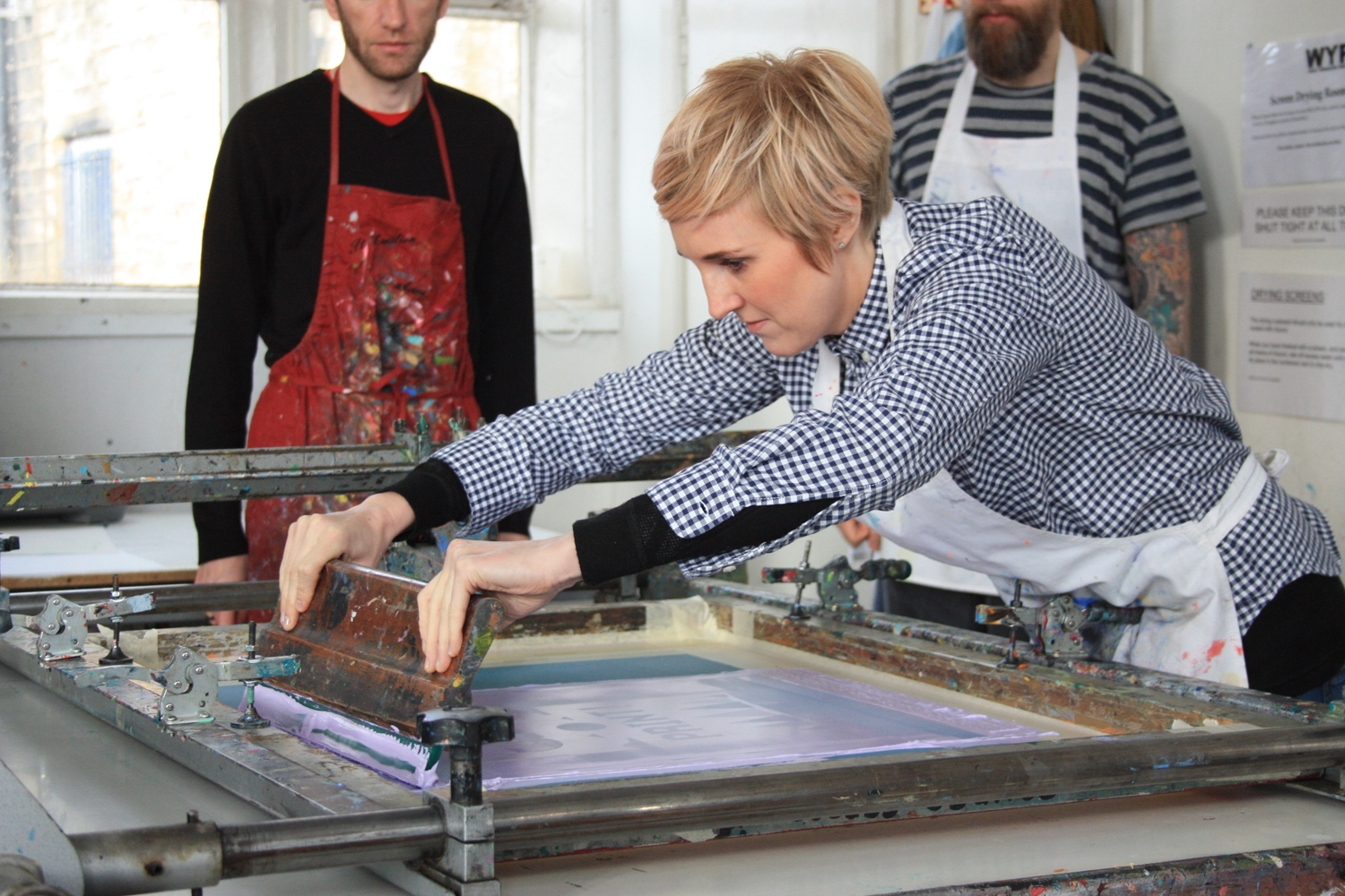
The pink / red paint is pulled over the mesh using a squeegee, pressing the ink through onto the paper below.

And here is the first colour on the paper.

Here are the posters with the first colour having been printed, drying on the racks.

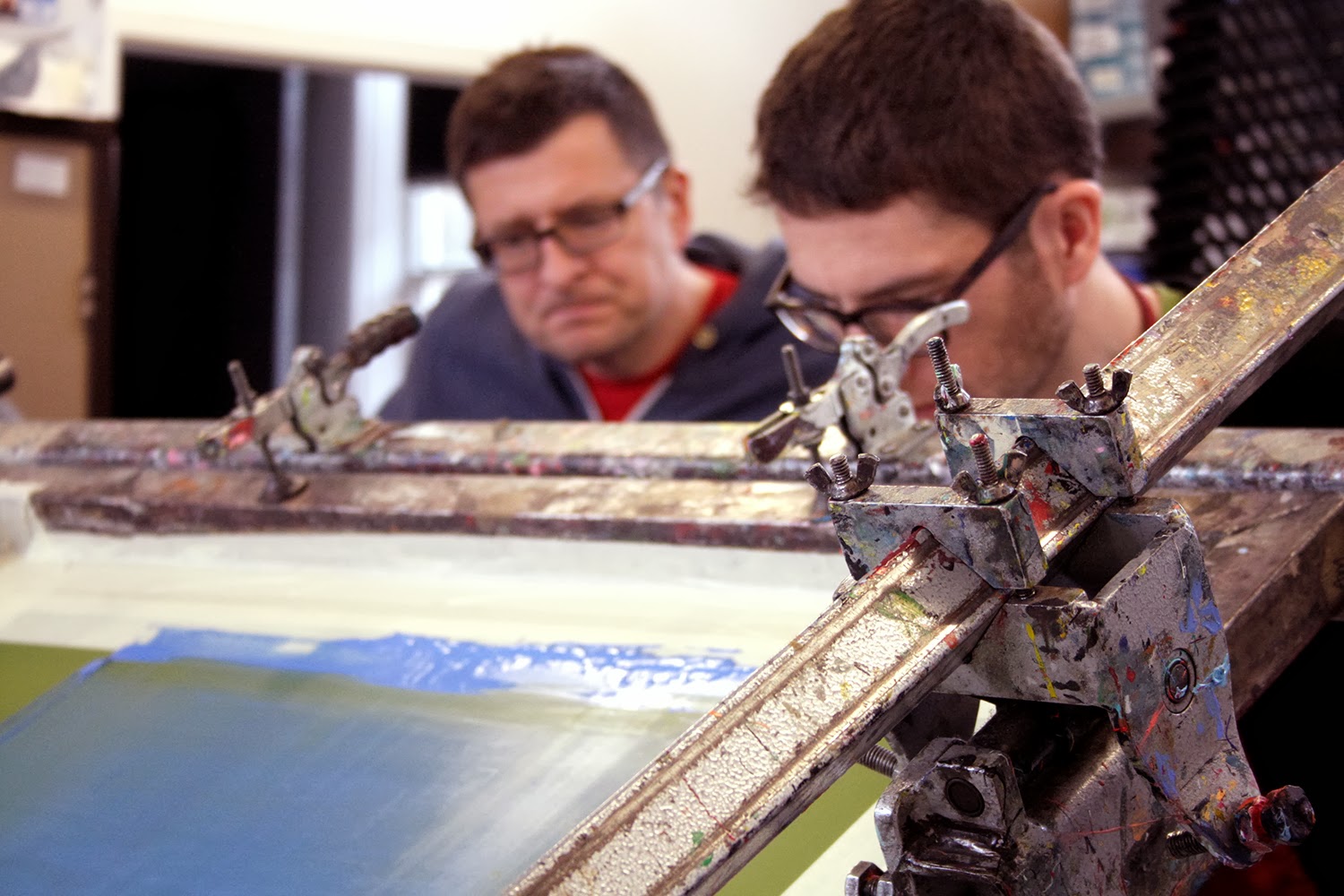
The second screen is locked in place and the process is repeated.

This picture shows the blue paint, having been pulled across the screen.

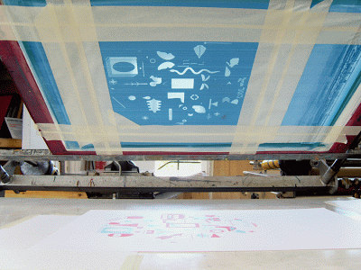
A photo from underneath the screen.

In this picture, you can see two pieces of paper where the top left corner of the poster is. This is for registration purposes and ensures that every time I put the paper down on the screen-bed I know that when the second colour is 'pulled' it will line up perfectly with the first colour.

Onto the third and final screen. Here is a picture of the screen, locked in the bed.

The third colour has now been 'pulled' through the mesh and the paint is transferred onto the paper. And by the looks of things, it's looking good.

Here are the posters, drying on the racks waiting to be cropped and then signed and numbered.

Here is the final poster, which has been cropped to fit perfectly in a square frame from the Ikea 'Ribba' series. I considered this when designing the poster, that people would like something that they could frame cheaply and easily.

I hope thats given you an insight into how the poster was designed and printed. In addition to this process blog, I thought it would be insightful to include a small essay which was sent to me by a very talented freelance writer named Janine Redding, detailing the history of screen-printing.

Screen Printing: A Brief History

Whilst some members of the artistic community that are deeply involved with screen printing will be the first to swear that it is a “timeless” method of producing art/copies/what have you, there might equally be those that would be surprised to learn that – at least as far as the overall process of printing goes – screen-printing is a *relatively* young concept, having really only been popularised to a great extent in the last hundred years or so.

An interesting point to mention would be that screen printing as a whole has remained relatively faithful to the original/early technology that was employed since day one, chiefly the woven mesh/stencil tech. Naturally, certainly aspects have changed with time (a good example being the move from silk mesh to polyester), but screen printing has by and large remained delightfully free of the awkward need for the biggest monitors, fastest CPUs, the best broadband technology race that has so effected other areas of artistry (or indeed that has permeated life in general).

The First Appearance – Traversing the Globe

Technically, screen printing’s actual first appearance in the history books would have been way back around the time of China’s Song Dynasty (960-1279 AD), in which it was scant more than a variation on a stencilling technique. Of course, this method flourished all over Asia and improved as the centuries rolled by; however, it wasn’t until around five hundred years later that it found its way to Europe/the West via trade routes and travellers.

Yet even at this proverbially late stage in the game, screen printing was still yet to take off in Europe, largely due to the fact that the requisite silk mesh was hard to come by, due to the limited number of them available by trade. This would have in turn driven up the price of the aforementioned screens, so a more profitable use for the process needed to be found – or even just a barely profitable usage, seeing as how screen printing was a fairly novel technology at the time, with not many commercial uses (in Europe, at least) found for it yet.

Widespread Use

Fast-forward to the early 20th century, where photography, printers, and photo-reactive chemical processes were all the rage. A trio of developers (Charles Peter, Roy Beck, and Edward Owens) would be largely responsible for furthering the commercial use (or at least the idea that it could be used commercially) of screen printing, via their experimentation with various chemicals to produce photo-reactive stencils (a method/idea which would – even then – take some time to find acceptance amongst the community), albeit these chemicals would prove to be somewhat toxic and dangerous, a problem which has – fortunately – been resolved for a good while now.

The 1930s would see the founding of the National Serigraphic Society (“seri” from the Latin for “silk”, a reference to the mesh used in the process) and screen printing was a veritable force in motion for both artistic communities and with great industrial printing applications.

Recent History and Pop Culture

An early adopter of the screen-printing-as-art philosophy was American artist and pop-culture icon Andy Warhol, particularly the numerous images of a screen-printed Marilyn Monroe. This rise and subsequent popularity of the both the artist Warhol and the screen printing method he employed would see a boom befall the screen printing industry and one that would continue on apace and is still a viable avenue of artistry to this day.

Arguably, perhaps one of the chief reasons that screen printing was and has remained such a popular mode of art, is because the materials required for basic screen printing are relatively cheap and easily available these days. Thanks in part to this, screen printing has become iconic, with its “non-professional” guise and seeming simplicity and has seen it grace everything from posters, to album covers, to shirts, to everywhere. Its prevalence is such that the Printers’ National Environmental Assistance Center has stated that screen printing is perhaps the “most versatile of all printing processes”.

If past advancements and recent years/decades are any indication, then screen printing and the implications it may have (particularly as a medium for art) can only see further improvement and increased interest – no doubt culminating in many an intriguing work of art for many moons to come.